While metals and foam have been steadily increasing in popularity for the manufacture of lobby signs, acrylic is the type of material that manages to maintain its top spot. This is not really a surprise. Consider the material’s versatility, its sophisticated look, the opportunity to create pieces of artwork that double as reception area markers and also the ease with which you can match colors as needed. The Sign Factory has worked with countless area companies that have come to appreciate the way the material perfectly embraces the marketing and branding messages of the businesses.
A Look at Some of Our Favorite Acrylic Lobby Signs in Charlotte!
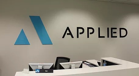
Take for example Applied. The company commissioned us to create one of our Charlotte lobby signs that would be perfectly centered behind the receptionist’s desk. The sign features black lettering in a company-specific font. The logo is created with the help of blue acrylic shapes. Because of the space left between the logo and the letter components, this sign takes up the entire wall and looks stylish, chic and perfectly underscores the company’s branding.
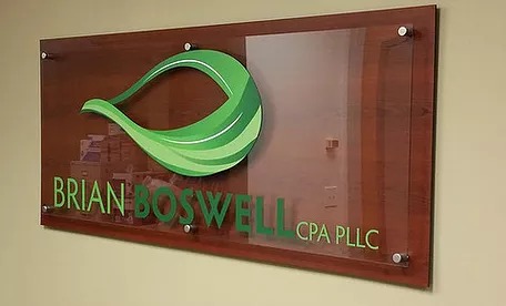
Transcending the merely functional to include artistic merit, CPA Brian Boswell asked us to add a sign that features a clear acrylic board. Mounted with brushed aluminum offsets to a wood grain board underneath, it features green writing and a green logo with plenty of detail work. The combination of green and brown looks stunning. Adding the glossy clear acrylic panel turns the sign product into a work of art.
While the accountant chose to have the lettering added by the overlay, it is also possible to add dimensional letters to an acrylic board. In the case of the Computech Corporation, the client chose a clear matte acrylic board that is offset-mounted with brushed aluminum studs. The lettering is kept in green and gray hues. The logo, too, stands out with the use of dimensional acrylic.
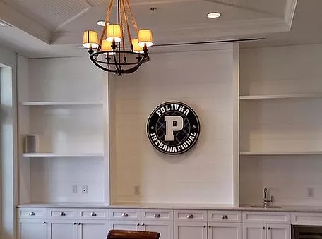
Dramatic displays that rely on light and shadows are also within the realm of design possibility. Polivka International requested a marker that would stand out from the wall. We used two different font sizes to allow the sign to be perfectly square in its presentation. Illuminated from above with spotlights, this marker now creates an attractive look on a light gray wall. It draws the eye because it makes a three-dimensional impression.
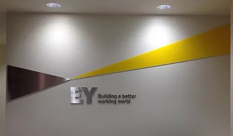
Sometimes, we use acrylic and aluminum together. The combination of the two materials showcases the versatility of the medium. Case in point is EY, which features the tagline “Building a better working world.” The acrylic adds a noticeable chic yellow flair to the brushed aluminum of the marker.
We’re Here to Help!
As you can see, acrylic lobby signs for Charlotte are here to stay. Talk to our knowledgeable signage makers today for more information and to get started on your order. When you already have a sign that you want to see translated into acrylics, we can help. If you prefer, we can work with you to design a lobby sign from scratch. This allows you to re-brand, if necessary, or just to enhance the branding message that you send to visiting clients or customers.
