Another new year is nearly upon us. It’s a time of those commonly repeated resolutions: drink less beer, lose 10 pounds, start a new hobby. What will your new year’s resolution be? As a business owner, you most likely have a plan for customer growth.
In the healthcare industry especially, the New Year is the perfect time to attract new Charlotte customers. But to really capitalize on the excitement of the New Year, you need to start planning now.
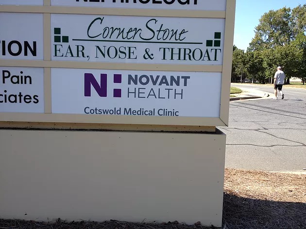
There’s no better time than now to re-evaluate your marketing, advertising and promotions to make sure you’re ready to go when 2014 hits. A major part of being ready is applying appropriate and well-planned signage. No matter how resolute consumers are, they’re not going to join your Charlotte healthcare center unless they know you’re there and open for business.
So here are three tips to help you put up the best health care center signage and pull in those New Year’s customers.
1. Location, location, location!
A snazzy sign in the wrong spot is just as bad as no sign at all. The placement of your Charlotte healthcare center signage is crucial. If your sign is too far away from your business, the customer won’t be able to find the front door. But if it’s too close to your business, customers that are driving by may not be able to see it and pass by your business.
The faster the speed limit of the road your business is on, the farther away you should put your signature. Generally, between 150 and 400 feet from the door is appropriate for a 25 to 30 mile per hour road, depending on whether or not drivers will have to change lanes. But on a 55 to 60 mile per hour road, much more space is needed — you’ll want to leave between 300 and 720 feet of space between your sign and your pull in. Of course, there are other factors that can determine proper placement of your signage.
2. Readability
Signs are made to be read. It seems obvious, but far too many business owners seem to forget this basic purpose when designing their healthcare center signage. Don’t use a fancy font. Don’t let design elements overwhelm the message. Keep your signage simple and compelling, and make sure the lettering is big enough to read easily from a distance. The general rule of thumb is to give letters one inch of height for every 25 feet of distance. So if you want your sign to be read from 100 feet away, use at least four-inch tall lettering.
3. Let your light shine.
A sign that’s illuminated yields twice as much advertising time as a sign that’s dark. A lit sign gives you 24 hours of advertising and is well worth the extra upfront investment. It really doesn’t matter whether you shine lamps on the sign face or use internal illumination as long as you make sure your sign is illuminated. This illumination assures that your healthcare facility will get noticed during the day or evening, on a clear day or a cloudy and stormy day.
When you work with The Sign Factory, we will survey your site to help you determine the best location, size, fonts of your signage, whether they are channel letter signs, post and panel signs or other exterior signs. Our experienced designers will create amazing signage for your healthcare center that is easy to read and attractive. The new year is coming along fast, so do not hesitate to update your current signage or to implement new signage for your Charlotte health care center. Give us a call at 704-321-0400.

